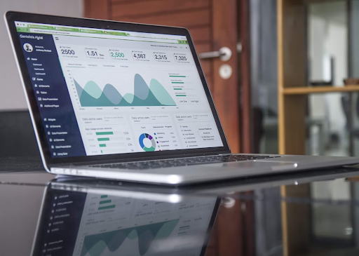
Dashboard templates are pre-designed frameworks that help businesses visualize their data. They save time, ensure consistency, and make it easier to interpret complex data. When done right, they provide valuable insights at a glance. In this post, we’ll explore the principles of effective dashboards to ensure your tools are most functional.
What Is a Dashboard?
A dashboard is a data visualization tool that aggregates information from multiple sources into a coherent view. It’s a dynamic report that updates in real time and allows users to monitor key metrics and performance indicators. Dashboards range from simple graphs and charts to complex interfaces so you normally choose a dashboard design template that fits your business goals.
Dashboard Design Principles
The backbone of an effective reporting tool is dashboard ux design principles. They ensure that the tool is functional and friendly. Here are some principles to keep in mind.
Clarity
Clarity is one of the central principles of good dashboard design. You should avoid clutter and unnecessary elements that distract users from the key data points.
Use clean lines, readable fonts, and contrasting colors to highlight important information. For example, use bold fonts for headings and different shades of the same color to distinguish between data categories.
Consistency
Consistency helps users quickly understand and navigate the tool. This includes consistent
- colors,
- fonts,
- and layout structures.
When users know what to expect, they can find information faster. For instance, if you use blue for sales data, stick to that color throughout the dashboard. This reduces the cognitive load on users.
Relevance
Ensure that the data presented on the dashboard is relevant to the user’s needs. Avoid overloading the tool with too much information. Instead, focus on the key metrics that matter most to your business objectives. For example, a marketing dashboard should highlight
- campaign performance,
- lead generation,
- and conversion rates.
Extraneous data like internal process metrics won’t be relevant here.
Simplicity
Simplicity is one of the dashboard design key principles that is often neglected (in vain!). It’s super important to keep the design minimalistic so that you don’t overwhelm users with too much information at once.
Use white space strategically to separate different sections and make the presentation more digestible. For example, rather than cramming multiple charts onto a single screen, spread them out over several tabs or pages.
Accessibility
Among the good dashboard design principles, don’t forget about accessibility — your tool must be accessible to all users, including those with disabilities. This can involve
- screen reader-friendly designs,
- text alternatives for visual elements,
- and sufficient color contrasts (for users with color blindness).
Flexibility
A good dashboard should be, among all else, flexible. This can include
- customizable views,
- filters,
- and the ability to drill down into specific data points.
For example, a sales manager might want to see high-level sales trends, while a sales representative might need detailed performance metrics.
Real-Time Data
Real-time data is particularly important for businesses that need to make quick decisions. For example, an e-commerce company can monitor live sales and inventory levels to make immediate adjustments. Put simply, real-time data helps keep the dashboard actionable.
Aspects to Consider During the Dashboard Design
As you see, the principles of dashboard design are largely centered on user-friendliness. Here are some more aspects to keep in mind in this regard.
- Consistency
Your design elements must be consistent throughout the dashboard. For example, if you use blue for headings, keep that color for all headings across the dashboard. This includes color schemes, fonts, and iconography.
- Mobile Responsiveness
The dashboard must adjust its layout and elements to fit different screen sizes. Use scalable graphics and avoid overcrowded layouts for the charts and graphs to be readable on smaller screens.
- Visual Hierarchy
A clear visual hierarchy guides the user’s eye to the most important information first. Use size, color, and placement for that. For example, place the most critical KPIs at the top of the dashboard and use larger fonts to make them stand out.
- User Feedback
Regularly ask users what they find helpful or confusing about the tool and make adjustments. This way the dashboard will remain user-centric. If users find a particular chart confusing, redesign it or provide additional context.
Final Thoughts
Now, you are aware of the core dashboard principles underpinning a good design. By considering these, you can create tools that look good and provide valuable insights for your business.
FAQs
How can I ensure my dashboard is user-friendly?
Prioritize a clean and intuitive design. Use clear labels, avoid clutter, and make navigation straightforward.
What tools can help in designing effective dashboards?
Platforms like SetProduct offer customizable templates, drag-and-drop interfaces, and integration with various data sources. You can create tailored and visually appealing tools with their help.
How often should dashboards be updated?
It depends on your needs. For real-time decision-making, dashboards should be updated continuously. For other uses, daily or weekly updates might be sufficient.


